Yellow Arrow Pointing Down

PATTERNS

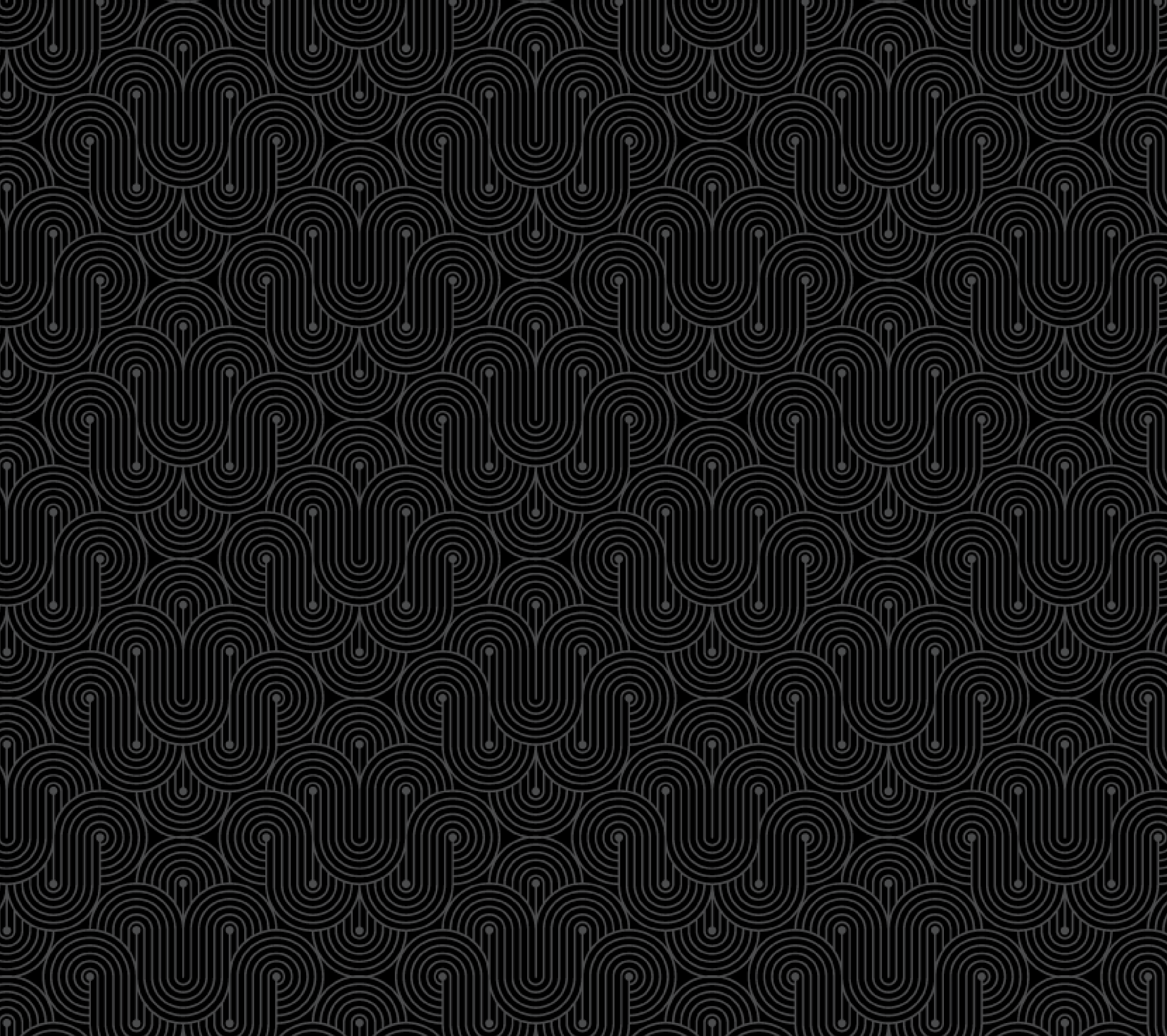
Since a big draw of Extended Play Bar is the countless records they spin, I thought it would be great to create a pattern that complimented the shape of a record. Something subtle in the background that would make the other content “pop.” These patterns became instrumental in constructing the menu and other Extended Play items.

EP EP_pattern

YUP! IT'S A MOCKUP!

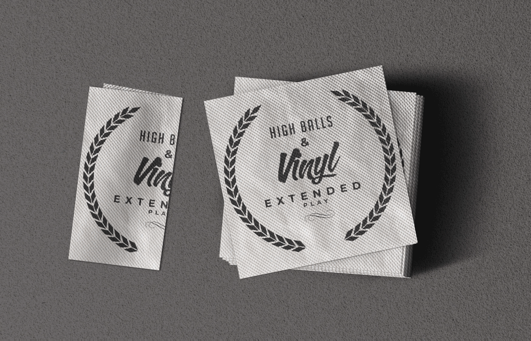
Check out these everyday things a bar needs. Whether its napkins for messy people, or matches for smokey people, bar swag is always a must.

Bar Matchbox Mockup
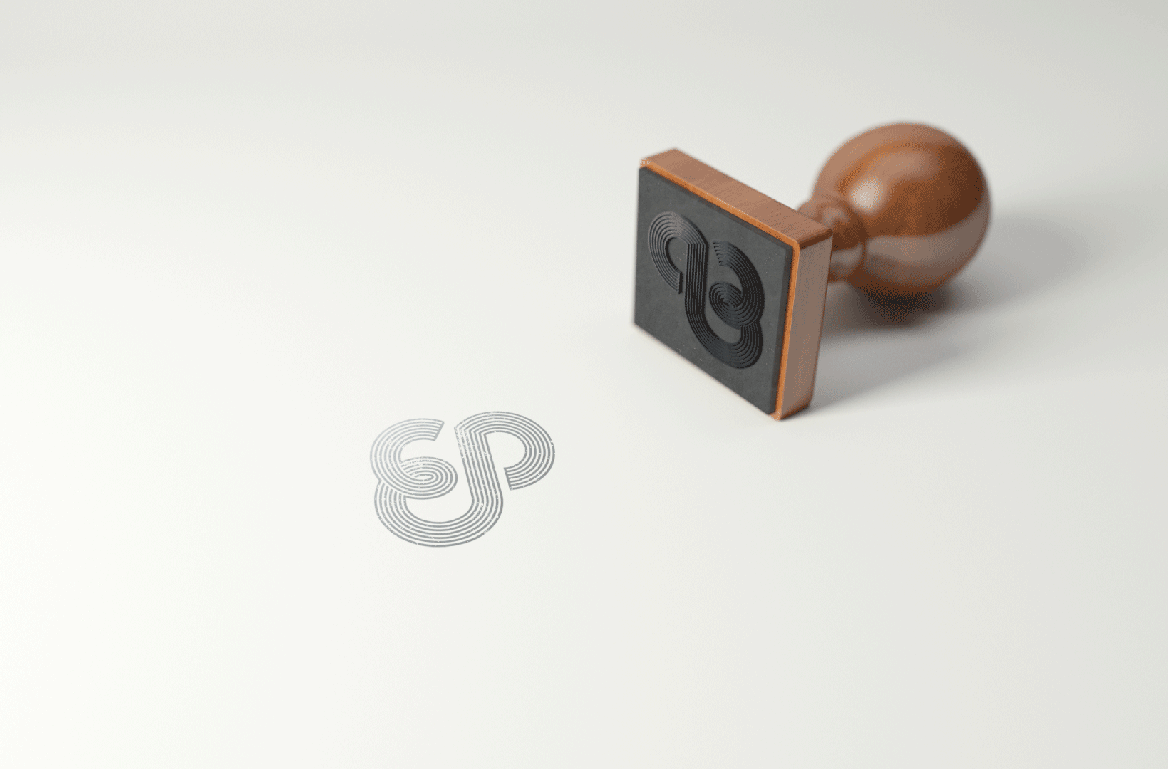
Bar Stamp
Bar Stamp
Bar Stamp

but wait

theres more!

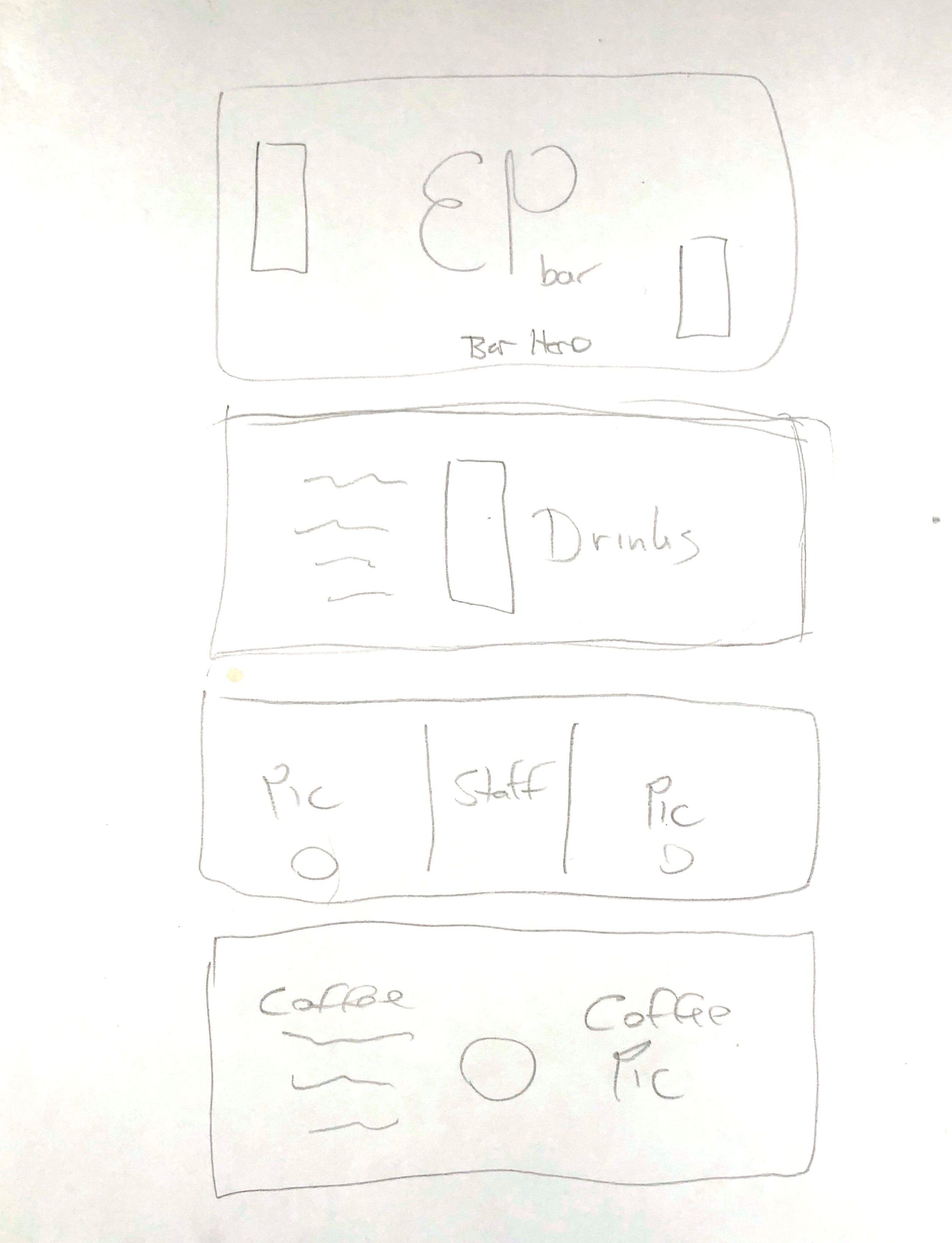
website sketch

LETS BUILD A WEBSITE SHALL WE?

It all starts with some shapes. Big shapes, tiny shapes, smooth shapes, hairy shapes... wut? A literal smörgåsbord of shapes! Well, not literally, but you know what I mean. Ooh, and lets add some content and typography as well. They say that content is king and typography is queen, and we don't skip on royalty here. I know, its not much to look at yet, but we're just getting started!

lo-fi wireframe

HOW LO-FI CAN YOU GO

Woo wee, now we get to the fun part. Lets do a lil' lo fidelity mockup. Lets organize everyting and maybe start putting in content. Still no color and still no typography specific to the design, but don't you worry, we'll get there.

hi fidelity mockup

A HI FIVE FOR HI-FI

Now we're cooking! Our vision is clear. We're adding color, we're setting type and we're designing our way to the finished website. Shall we program? Shall we code? Shall we develop this thing into something we can surf on the interwebs? Um, yes!

AN EVOLUTION OF SORTS

Look, I know I said our vision was clear... But hey, things change. Things evolve. Sometimes I go down a rabbit hole of fashion magazines and change everything. I'm always learning new things, and why not incorporate those news things into your designs. Is it the right way to do things? Maybe not, but the heart wants what the heart wants... and I think it turned out pretty darn good in the end.

DIDN'T YOU GET THE MEMO? ER... DEMO?

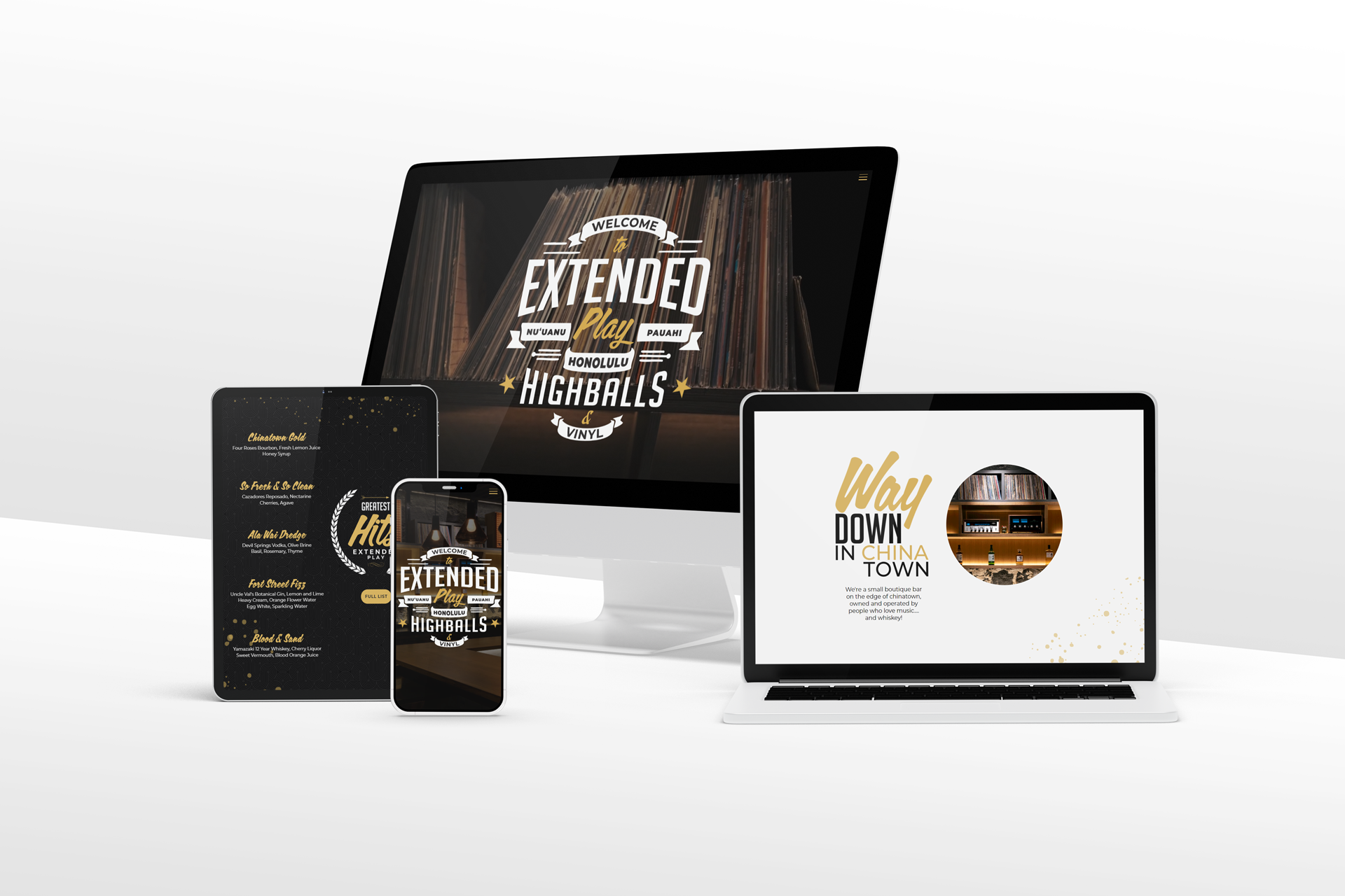
First off, check out that mockup below. Pretty sweet right? Yeah, Sometimes a mockup just turns out perfectly. Secondly, you wanna see a demo of the website? Its fun to navigate and has some cool functionality. All you have to do is click on the button to the left. Come on... Do it... You can't say no.
EP Bar Mockup